This theme flows naturally from the first video/TV work we did for Lesko. It’s a simple line that says a lot about the firm’s unique selling proposition. The brochure illustrates that they’re not focused on investing as a destination or an end in itself but as a means for navigating life’s journey.

When the Food Bank of the Southern Tier learned it would have to purchase and retrofit a new facility for its important work in upstate New York, they looked to Riger for the creation of two brochures – one photo-centric, testimonial-heavy one for show and tell and one statistic-oriented one to leave behind for more details.
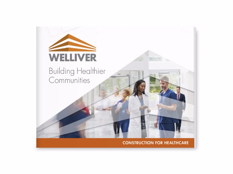
Welliver has been constructing healthcare buildings for 120 years, but needed a piece to dynamically tell the story of their experience and expertise. We gave them a confident, clean design with plenty of white space.

Purposefully minimal. Striking color variation. This easy read of eni’s benefit integration capabilities and competitive advantage practically begs to be flipped through.
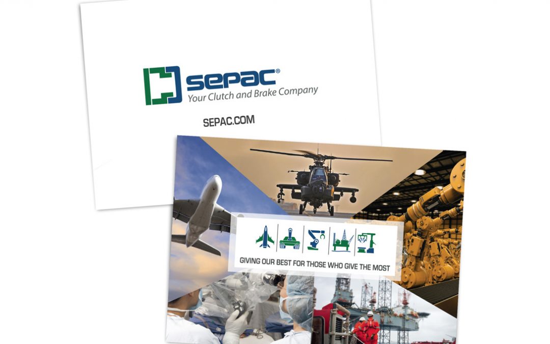
“Our prospects know we make brakes and clutches, but they may not understand how diverse our offerings are.” That’s what we heard from our client SEPAC, a manufacturer in Elmira, NY. Riger’s solution: a series of icons that would accompany an institutional tagline, showing off SEPAC’s various customer groups at a glance on a glossy card.