When an institution with the history and stature of Corning Museum of Glass sets out to change its identity and add a new wing, simultaneously, it is not something to be taken lightly.
It is something to behold. And, of course, it’s always interesting to learn more about branding.
CMOG’s new addition and brand were on magnificent display when we visited with Rob Cassetti, senior director of creative services and Yvette Sterbenk, senior manager of communications, at our Finger Lakes PRSA meeting at the museum in Corning, NY.
Riger has always espoused to our clients, “Your brand is a promise.” In CMOG’s case, they have stayed true to their brand promise of leading visitors to see glass in a new light. In fact the new tagline to go with the clean and stylish new addition is: “New Space, New Light.”
The new space is, to my eye, a brave new light: both inviting and futuristic. One tour guest remarked the conference room reminded him of the movie “Contact.” I had to agree it felt like we could be strapped in and hurdled into outer space at any moment.
According to Cassetti, the overall aesthetic was driven by a desire to use black and white as the backdrop and allow the museum art (glass creations), gift shop items, or café food to provide the color. It works. The glass pieces pop!
So if you’re getting the image in your head that the new space looks a little like an Apple store, you’re not far off. Bright white is everywhere. Except the demonstration area. In a deft homage to the tradition of glass blowing, the demonstration amphitheater is all black. We learned many of the designers of the artwork found in today’s museum cut their teeth in the Steuben Glass factory, the precise location of the new demo room. That’s a nice symmetry, good PR, and an effective connector of generations for a place that’s been making glass for over 150 years. Besides, an orange flame looks really cool against a black background.
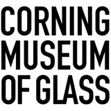
As for the logo design, it was a labor of love, according to Cassetti and Sterbenk. Their team did the research, knew what they liked, and hired three different designers to get them where they needed to be. The result is a new typeface, black-and-white motif that works well in both positive and negative, a squared-off stacked logo and a linear (unstacked) version for applications where the block logo won’t work. Square but unboxed, it’s clean and elegant, and its simple, powerful design communicates that creativity should not be put in a box. This logo shouldn’t either. What it should do is show off Corning glass in a favorable light for generations to come.
Kudos to Corning Museum of Glass. May your new light burn brightly and shine clearly for another 150 years.
Written by Steve Johnson, Managing Partner